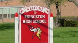
In years past, pencils and paper, chalk and chalkboards were common sights on school campuses. Fast forward to 2007 — personal laptops, PDAs and PowerPoint presentations are the communication tools of choice. The traditional images that came to mind when remembering one's school days are no longer. Evolving technology and innovations in school equipment and supplies are now the norm … and the same can be said for signs.
Students, staff and visitors are constantly on the move around campus, and they are bombarded with visual information. Signs on campus must communicate a message quickly and create a positive image. Schools should not overlook the many benefits that innovative signs and graphics can provide.
The basics of signage
Signs and graphics have three general purposes: to inform, direct and sell. When looking for ways to draw in prospective students or inform a campus about an event or new building project, effective signs and graphics, among advertising mediums, can offer a high return on investment.
People often develop their initial impression about a school or a business through the signs and graphics that it uses. What many campus facility managers may not realize is that compared with other advertising media, signage provides great exposure for a small investment. For example, a school may spend $200 for a sign or banner announcing a new addition or perhaps a fundraising event. It is placed in a location with ample foot traffic, and about 1,000 cars pass by every day. In just one month, 30,000 drivers will see the sign. With an initial investment of $200, an institution can maximize its presence within the surrounding community while heightening awareness at a minimal cost.
Construction and renovation projects create a need for more signs. An important issue to consider on these sites is safety. Well-placed signs can inform construction workers and visitors of the safety precautions typically required at a building site.
Curiosity is a constant where there is construction. Warning signs can keep those who are not involved with the project out of construction zones and out of harm's way. To quell that curiosity, consider placing a “Coming Soon” sign or a graphic featuring a rendering of the project. Incorporating safety signage will inform curious minds about what's coming, direct them to stay back and away from a dangerous construction site, and can even sell registrations or increase attendance at the facility once the word gets out about the new development.
Signage options
Directional signs are useful in guiding students, administrators and guests around the campus. Full-color graphics and photos help create signs with high visual impact. According to a study by the Direct Marketing Association, using a photograph creates a 300 percent greater recall among viewers than a sign without photos. With the help of a digital printer, full-color graphics and photographs can be a part of virtually any kind of sign project.
Today's technology allows for infinite color combinations, distinctive typestyles and full-color photographic images. Colors are important in signage because they have an instant effect on people and make the message more memorable. Use colors to communicate the image or personality of a school or university.
Banners are one type of sign that definitely has come a long way. Many schools place banners across a building's entrance to announce upcoming events such as parent-teacher night or a sports event. Banners are an inexpensive way to promote an event, inform people on campus or provide directional support. A banner can lead to increased attendance by students or the community to on-campus events. Banners are ideal for indoor and outdoor use, and are durable, weather-resistant, reusable, easy to transport and simple to hang.
Working hand-in-hand with safety signage, vehicle graphics can help identify campus police, maintenance crews, school buses and other school-owned vehicles. Vehicle “wraps” that go around the doors, back and front of a vehicle, displaying eye-catching, photographic-quality images and vibrant, long-lasting colors, are becoming more popular. These “billboards on wheels” are constantly on the move, amplifying exposure to students on campus or even prospective ones in the community, and building name recognition for a facility.
Choosing the right sign
To communicate successfully, signs should be highly visible and attractive. There are many choices when selecting even the simplest of signs. When deciding among the different options available, consider:
-
Is there a specific image or theme that the sign or graphic should portray: School colors? A mascot? Classic or modern look?
-
What are the signs being used for: temporary or permanent, indoors or outdoors?
-
How will it be installed?
-
What is the planned budget?
-
If for exterior use, what kind of weather will the sign be exposed to?
-
How long will the sign or graphic be used?
-
Who is the target audience?
-
What is the viewing distance for the sign and the amount of time it will take for viewers to read it?
-
Are there any permits required or restrictions imposed on the sign?
-
When will it be needed?
-
Do your signs comply with the Americans with Disabilities Act (ADA)? The legislation affects everything from the percentage of contrast between the background color and the letter color to the font selection.
Another way to maximize the value of a sign is to add a border, which focuses attention on the sign and helps the viewer read it 26 percent faster, according to research done by the Pennsylvania College of Optometry. Consider displaying any special information in a second color, which increases the reader's retention by 78 percent.
To make the most of signs and graphics, keep in mind these four tips for effective design:
-
Visibility
Make sure that the sign's lettering is distinguishable from its surroundings. Color choices and graphic elements can help the sign stand out from background clutter that might distract the viewer's attention.
-
Readability
This helps to ensure that the viewer reads the sign correctly and comprehends the message accurately. Certain color choices and combinations can increase readability, especially at a distance.
-
Noticeability
Achieving noticeability, which refers to a characteristic of a sign that draws the reader's attention, can be done easily by changing its colors, message, size or shape frequently.
-
Legibility
Make sure the design of the sign enhances the distinction of individual letters. Take advantage of the right typestyles and spacing, which can help viewers read a sign easily and quickly.
Townsend is the senior vice president of marketing for FASTSIGNS International, Inc., Carrollton, Texas.


